Support center

Provide you with comprehensive product operation guidelines

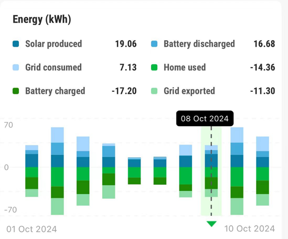
The energy page allows you to view data on your home’s energy consumption and generation over time. You can also see how much power a device is running on a particular day by selecting that day. Below is a detailed explanation of the charts.
Each bar in this graph represents a day’s energy situation.The positive axis, which is the blue part, represents power supply, and the negative axis, which is the green part, represents power consumption.

The positive and negative values here are just to distinguish whether this energy is supplied or consumed.
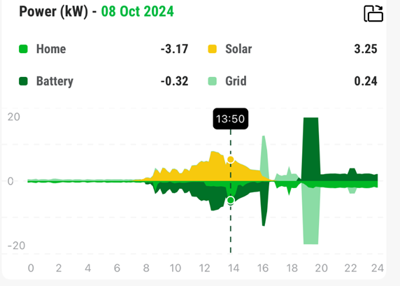
Once you have selected a day in the chart above, the chart below will show you the power details for that day.The positive axis of the graph indicates that the device is supplying power, while the negative axis indicates that the device is consuming power.

For example, the power of a battery on the negative axis means it is charging and on the positive axis means it is discharging.